This thread will collect feedback for the new measurement form currently in beta (which can be found at https://atlas.ripe.net/mform).
1 Like
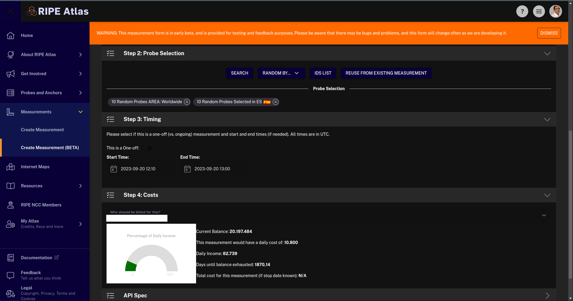
Definitely a better design, especially the probe selection is way clearer this way.
Also cost layout is nice.
I believe the idea was to put more emphasis on the tags, is that no longer the case (because they are perhaps a bit more hidden now)
Hi!
Love the new design, less clutter and I think it is a good idea to not show all advanced options from the beginning.
Some feedback from me after a quick glance:
Definitions
- The tooltip for “Spread” should probably mention the unit of the value (seconds)
- For HTTP measurements, a tooltip for “Extended Timing” and “More Extended Timing” would be nice
Probe Selection
- Random by: Love the dropdown for tags, but maybe should be sorted alphabetically?
Timing
- Mention that the specified times are in UTC
Nice work!
Malte
Hi Bart,
Thanks for the feedback. Are you talking about the global tags applied to the probe selection (currently available in “Random by…” selection) or your personal tags that can be added to any of the definitions? If the former, are you saying your preference would be to be able to add these global tags in more places (for instance, from the search map)? Or am I misunderstanding?
Thanks again!
Stephen
Hi Malte,
Great suggestions, I have added/fixed all of them in our dev build, and will roll out these changes to production beta soon. Thanks for the feedback!
Stephen
Hi, I’m talking about the personal tags.
I had an atlas workshop at my university and they were pushing personal tags a little bit because it was barely used.
Hi, on this form we’re in the context of tagging measurements (as opposed to probes). We consider that a useful feature for the community at large if used, so the form supports it.
Hi Bart,
Thanks for clarifying. One of the main goals for the new form was to simplify as much as possible the creation of measurements, and that has meant hiding more advanced fields (including tags) under the more options button. Personal tags can indeed be very powerful, but they are somewhat of an advanced configuration. I will talk with the team and see if there is a way to make them more prominent without compromising simplicity in the form. Thanks again for the feedback!
Stephen
1 Like
I like the format, I find it very practical, if it could be possible later to save or consult a repository of other searches it would be interesting, thank you very much.

1 Like
Hi! Came here specifically to say that a) the new form is looking great, thank you! and, b) my first thought when populating a measurement spec was similar to comments above, that the description and tags fields are hidden away but maybe these should be encouraged.
I almost always modify the description of a measurement. It helps me disambiguate measurements, and it helps me find the correct measurement if I want to recycle a set of probes in a new measurement. (Alternative: if probe selection by “reuse from existing measurement” could use measurement IDs, that’d also help.)
Regarding tags, I don’t use them nearly as often as I modify the description, but I do if I’m running a series of related measurements. I definitely modify these way more than some of the very advanced options, like most of the traceroute-specific options for example. Recently I worked with some folks who didn’t know that tags were possible, and it may be nice to passively encourage their usage.
Hi Stephen, thanks for the feedback, this is exactly what we’re looking for now.
In the new form we were trying to make it possible to add as simple as possible specifications, so hide all the advanced stuff (and the really advanced stuff ![]() ) We’re curious if this is too much or not.
) We’re curious if this is too much or not.
Of course it is possible to shuffle some options back to the default section - the question is really: are the majority of users fiddling with those or not. On the other hand, we’re also trying to avoid multiple layers of advanced options…
So, keep the feedback coming to help us tweaking the layout and functionality the right way! ![]()
hi Stephen! Thanks for the feedback. We are looking into what makes sense for novice vs advanced users, and are gathering data now. We may end up having a permanent “advanced” switch that always shows fields for advanced users, stay tuned. One thing I wanted to add is that you may not have noticed it, but reuse from existing measurement ID (if I am understanding you correctly) is actually in the form, here is an example:

It probably does makes sense to specify that one can search by msmID or description though, so I will add that to the form.
Thanks again!
1 Like
Ah, neat! I didn’t realise I could paste a measurement ID. (Did that also work on the old form? Have I been driving wrong all these years? ![]() )
)
No, this is indeed a new feature in the new form only. You have not wasted any time all these years. ![]()
1 Like
For me, as occasionally user, hiding some settings behind the [+ MORE OPTIONS] button is fine, except Description, that is something I would always want to edit.
One thing - there is IPv4 / IPv6 switch, that does not clearly show what is choosen/active. White vs. Gray. On a first sight I would guess the brighter (white) is the active one, while gray indicates inactive. This is not the case though. Grayed button being the active one? Not really intuitive for me. I would suggest use some kind of green-ish.
Thanks for the feedback, we will look into making these changes.

Happy to announce the new form is now released! It is now the default (and lives at the same url as the old) and the old one has been renamed legacy and is still available for a while in the menu and linked from the new form. Please check it out and let us know if you find any issues. Thanks for the feedback during this process!
2 Likes
We updated the form with a few improvements since we last posted:
-
You can now shift-select a rectangle over particular probes on the map, even if you have already conducted a narrowing search (like for a particular ASN)
-
We have improved the clarity of the form when there are warnings (such as no probes selected)
-
We also updated the copyable API spec and tweaked a few spacing issues here and there
-
We improved the probe selection to differentiate between ASN v4 and v6
-
Finally, as of yesterday, we have retired the legacy form completley.
Please let us know what you think.
Thanks!
Stephen
RIPE Atlas UI
